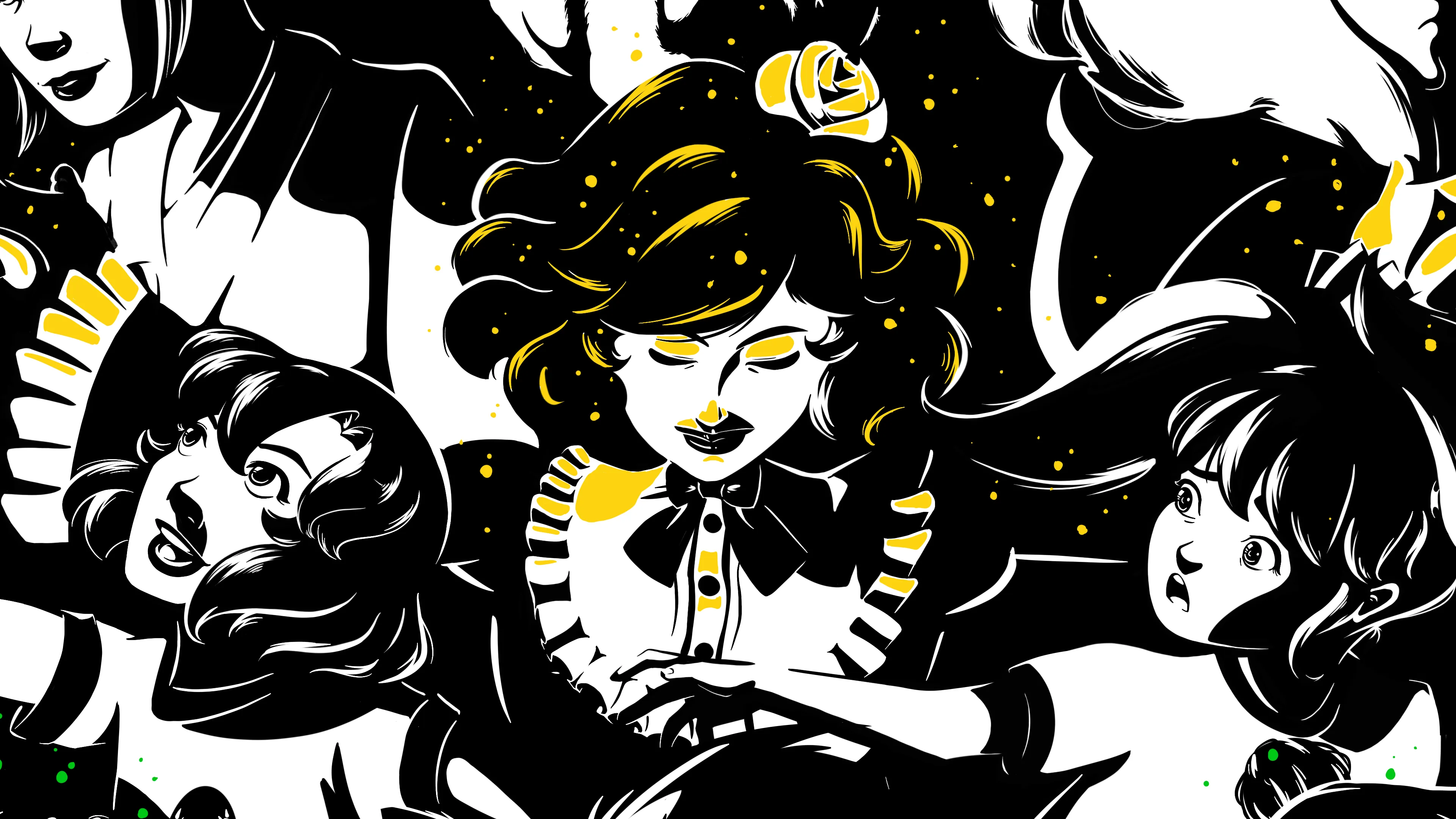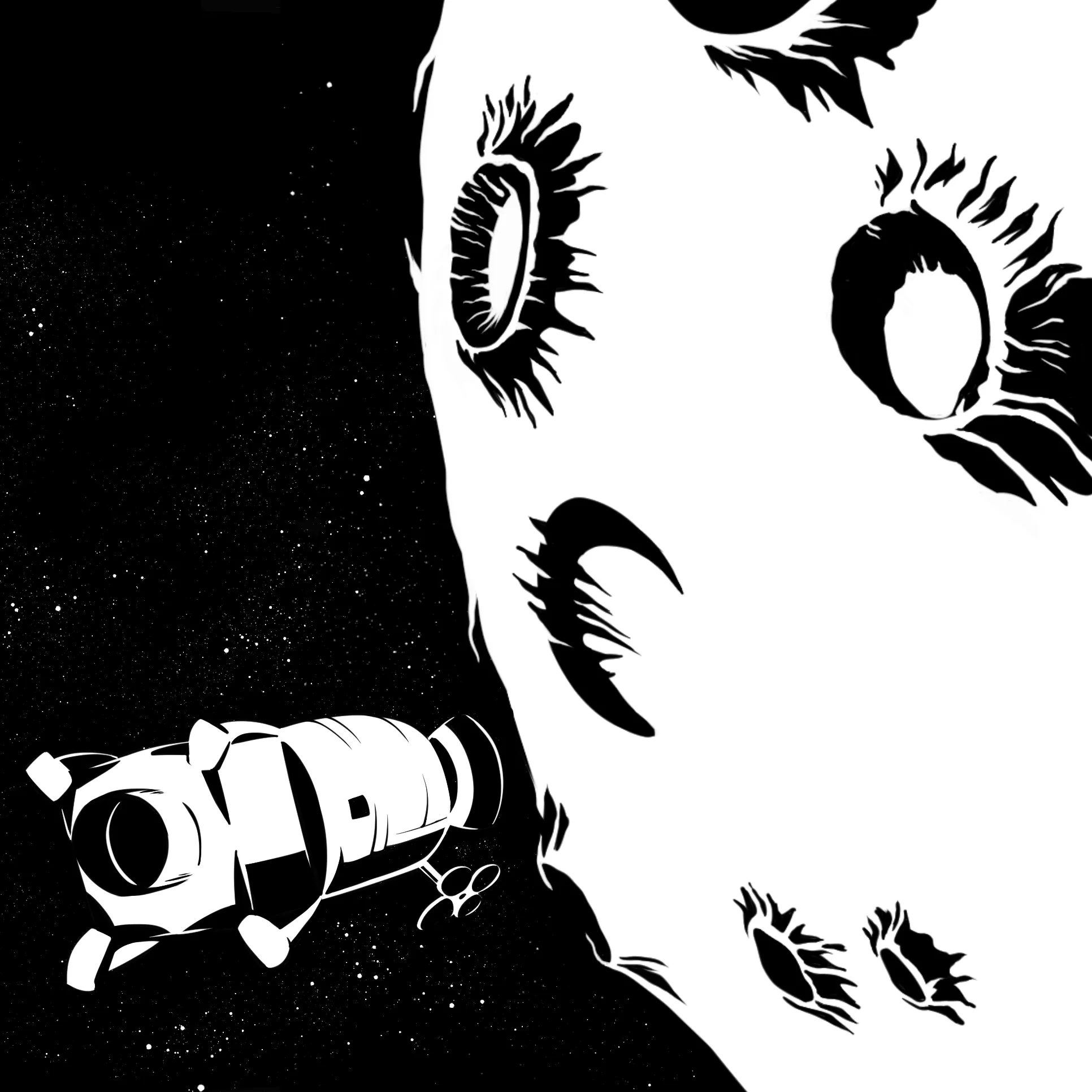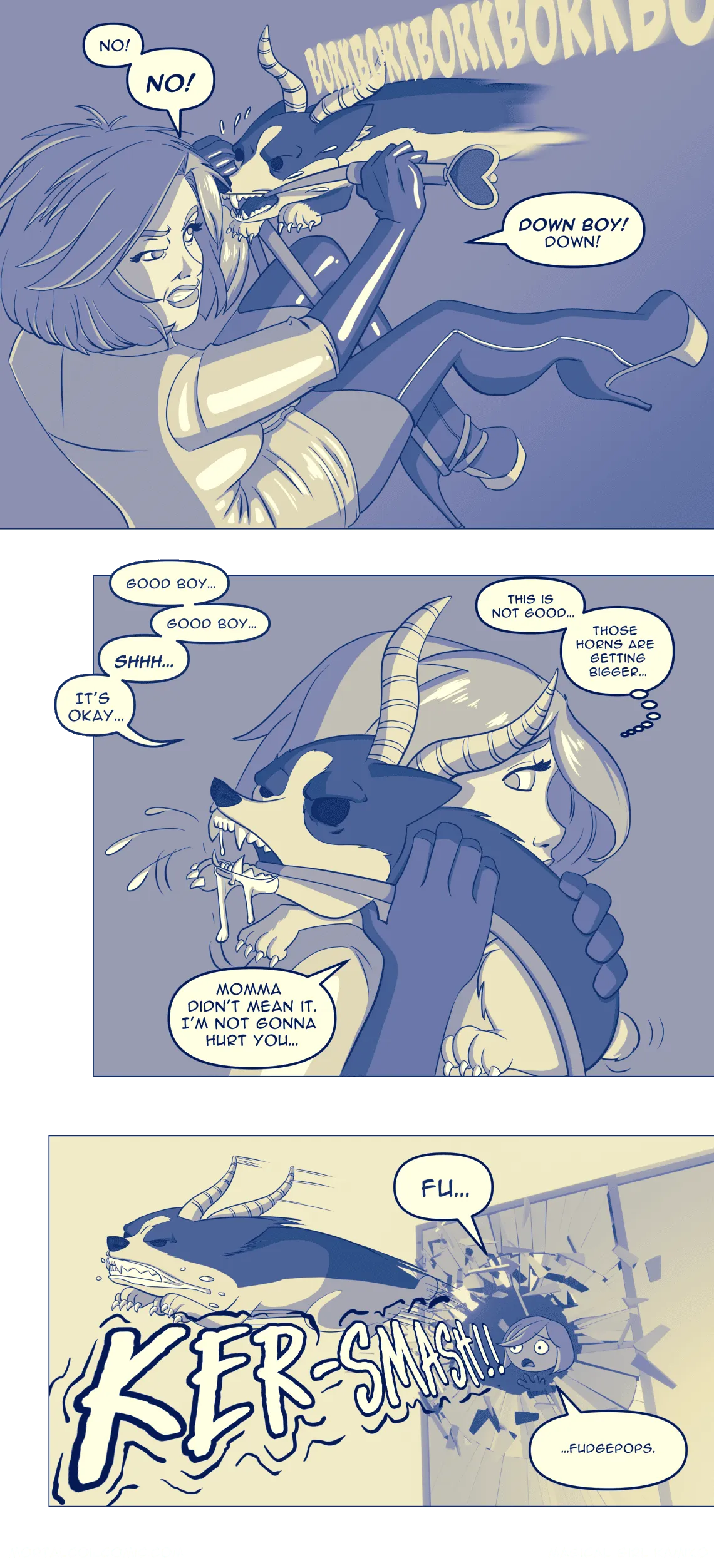
Aww, fudgepops! Catherine’s purgatory pup is on the loose now terrorizing the streets of Tokyo with its cute tiny body, stubby legs, and giant demon antlers.
All thanks to someone who didn’t fix that issue… you know when she tried to.
What’ll our magical girl dominatrix do next? You’ll have to stick around and find out.
Behind the Scenes
Before we move away from Catherine’s introduction chapter — there’s one more minicomic which I’ll save for next weekend. I did want to share some behind the scenes artwork I did to help create these visuals.
Affinity Designer: UX Mockups
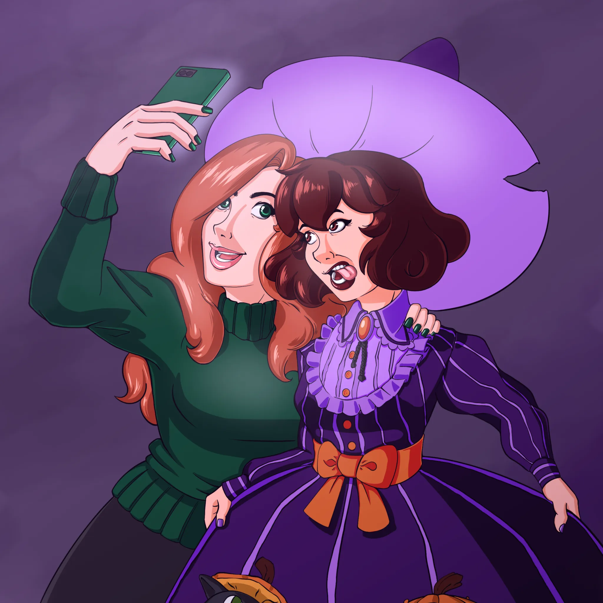
For the first comic in her short serial, there were some cellphone images. The smartphone is actually my smartphone — so she’s got an iPhone 8 apparently, but I wanted to produce some parody UX of a fake app called “Pictogramme” which sounds like, well, you know.
To do that I used a program called Affinity Designer. It’s a vector illustration tool much like Inkscape or Adobe Illustrator. I bought it a while ago to act as an Illustrator replacement. Also, Affinity Designer is a one-time-payment instead of subscription model. And yes, Affinity Designer has free updates, and a lot of useful features out of the box. So if you’re looking for a cheap Illustrator replacement, I recommend it. Of course, I also recommend Inkscape.
Affinity Designer has an Artboard mode which allows you to do UX mockups. If you were working at a software company you might use it to build the UI layout for an app. Affinity Designer comes with dummy headers that you would see on your cellphone (where the battery life, cell signal info is located), mockups of iOS style buttons, etc. It seems primarily iOS focused — I didn’t see any Android styles.
This artboard tool is what I used to mockup the fake UIs by dragging and dropping these UI elements and then my own custom art. Here’s what they look like when they’re not enclosed by the other art in the comic:
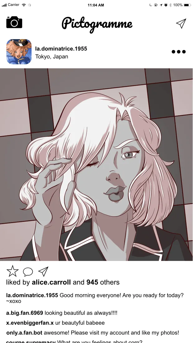
I drew a custom image of Catherine in her PJ’s for the candid “selfie” shot and surrounded it with pho-UX stuff from Designer’s drag and drop UI elements. It didn’t take me too much time to make all of that up.
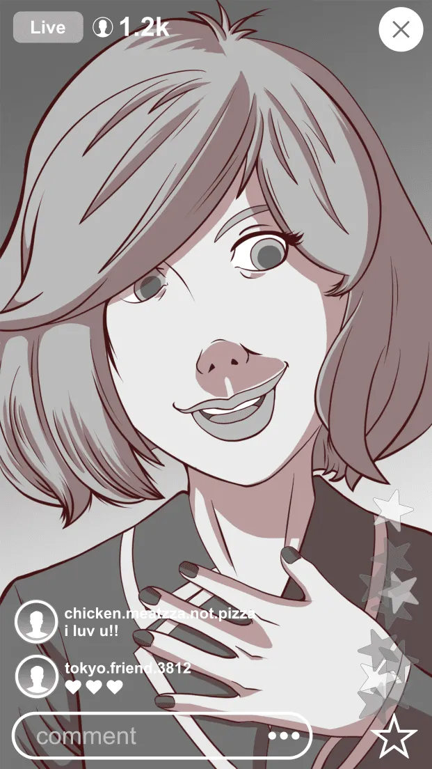
For the livestream feed — since I don’t use Instagram much these days, esp. the live stream feature — I had to look up some screenshots. And also, it didn’t have to be 100% like Instagram since it’s meant to be a parody of the app. I didn’t worry about getting it down to a ‘T’. I think Instagram even has the floating hearts, but I recall them first from the Periscope video sharing app.
Affinity Photo: Texture Liquify
Throughout the comic, she’s got a really nice plaid blanket. It is in fact, a blanket I own. and I decided to use it to get a quick texture for her bed. Actually that first shot of her sitting in bed is a trace over of a picture I took of myself sitting in bed.
For some images I cut the texture of the blanket out and turned it into layers of grayscale. For some other images in the comic I actually used Affinity Photo to help me liquify the texture to conform to what I had drawn — at least as much as possible. Here’s an example of how I might manipulate the texture:
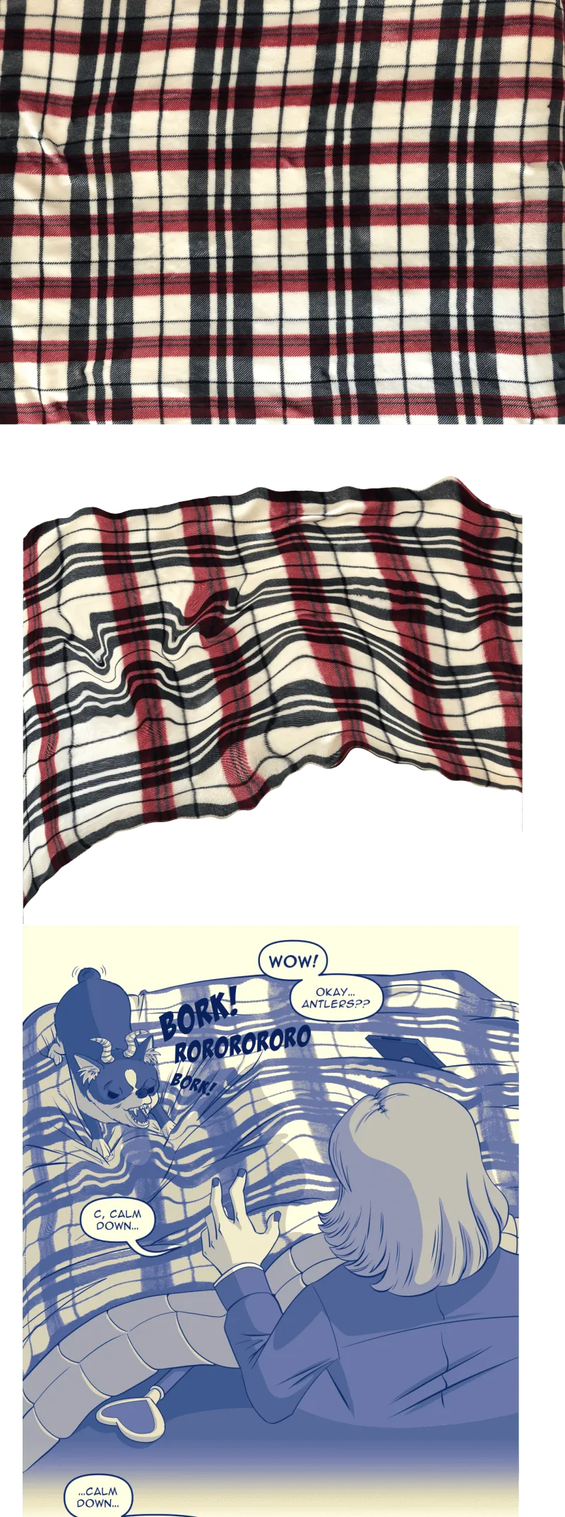
In this example, I have a nearly overhead shot of the blanket to get the flat texture. From there I can manipulate it into perspective for my needs. I use Affinity Photo’s liquify mode which allows me to warp the image over a 3D grid. This way I can give the appearance of wrinkles from where Catherine is sitting in the bed and where the pup has his feet pushing down on the blanket. It’s not perfect, but helps make the texture appear less flat.
Affinity Photo is in the same suite as Designer. It’s also a one-time-payment (like $50) and you get free lifetime updates.
There’s some great features, and the one showcased here is my attempt to use Photo’s liquify to push and pull the pixel pattern around.
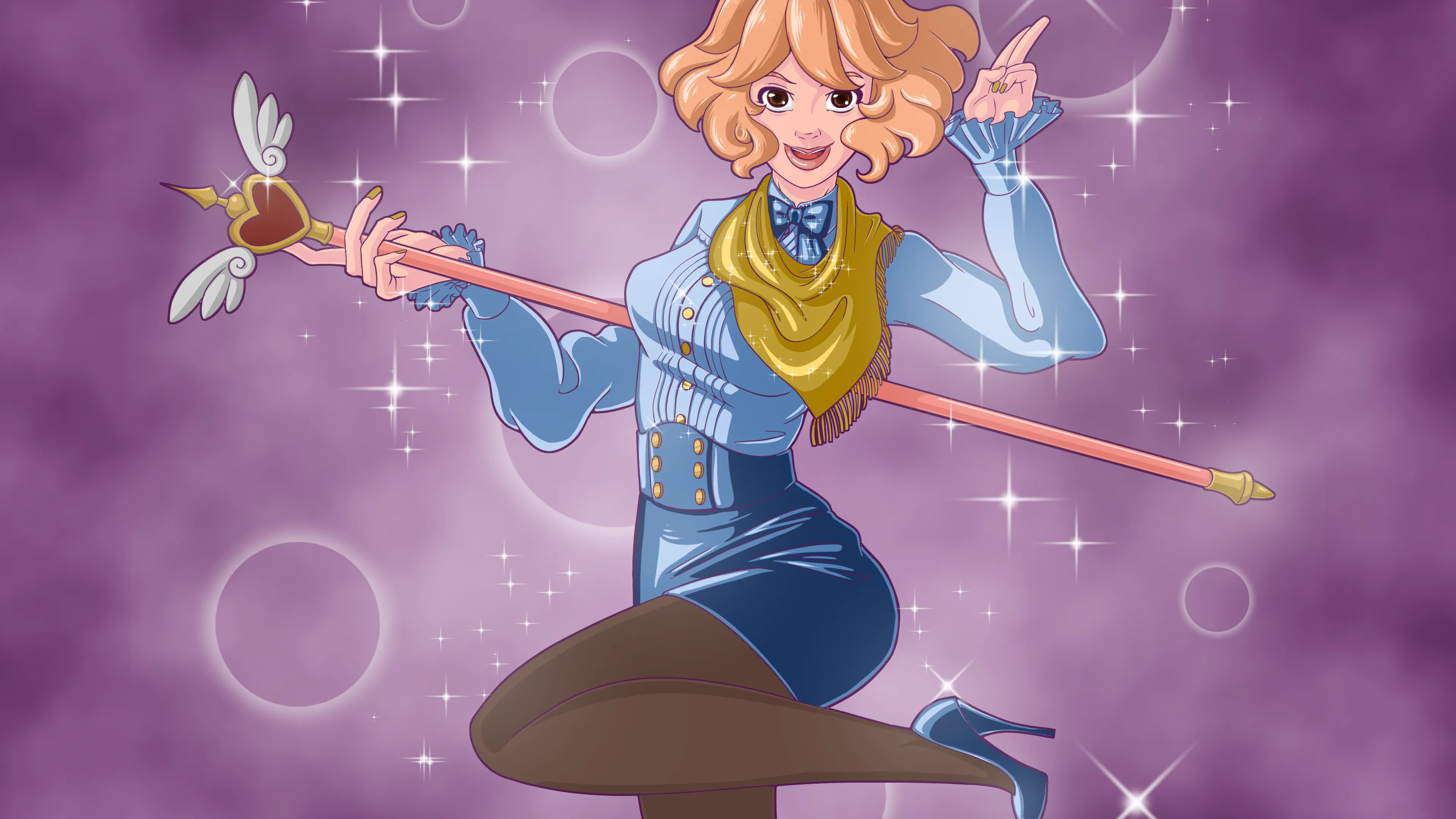
Blender: Posing with Rigged 3D Character
You were probably wondering when this was going to come into play. Some of the scenes are setup using Blender — especially when it came to her magical girl transformation.
Not just same face, but same body, amirite.
So yeah, Catherine uses the Natsumi/Kamiko bunny girl 3D model I made. When I sketch over the 3D mockup I try and tweak things for each of the characters. I do have a dedicated 3D model for Catherine, but that model has some issues, and by issues I mean a lot of problems. The bunny girl Kamiko model is rigged using AutoRig Pro and is lighter in terms of polygons so she’s faster to pose. Since I’m lazy, I use the mannequin for both characters.
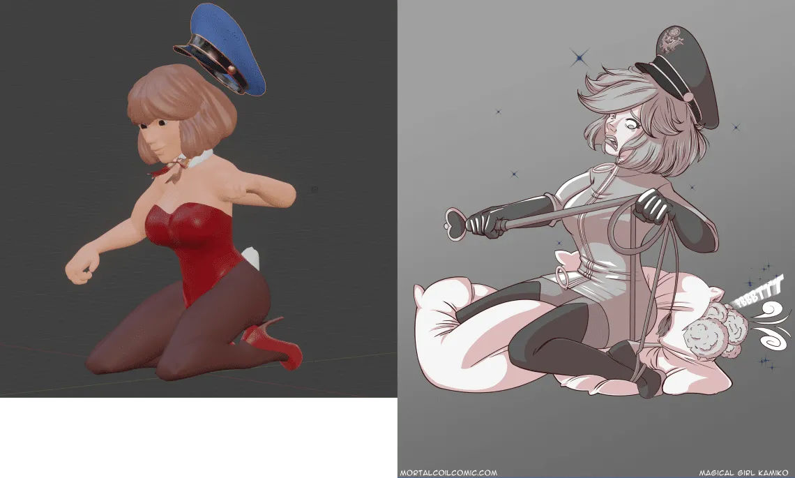
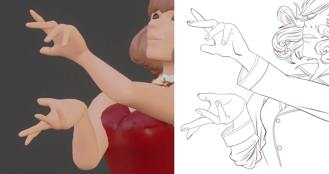
Here’s another mockup versus the final of the illustration of Catherine transforming while on the bed and getting tangled up in her whip. I don’t mind that the mannequin has dead eyes or whatever. It’s meant to explore the pose and camera angle before selecting something that works and rendering it out. I don’t use Eevee or Cycles. Sometimes I have Blender take a screengrab and use that as a draw over.
The benefit of using Blender is to speed up character posing and composition of a scene. It’s not perfect, but it’s supposed to get me 80% of the way there and then I gotta do the rest on my own to get the result I want. Sometimes if the shading is really good, I might use it, but for characters I tend to pencil, ink, and cel-shade it all digitally. Maybe oneday when I have a 3D version of Natsumi and Catherine that are really good, mid-poly models I might be able to take it to the next level. Blender does have the capability to outline 3D models and do non-photorealistic rendering, so it’s not out of the question. It’s a matter of growing my skill in that direction.
But, that said, I still want the human touch.
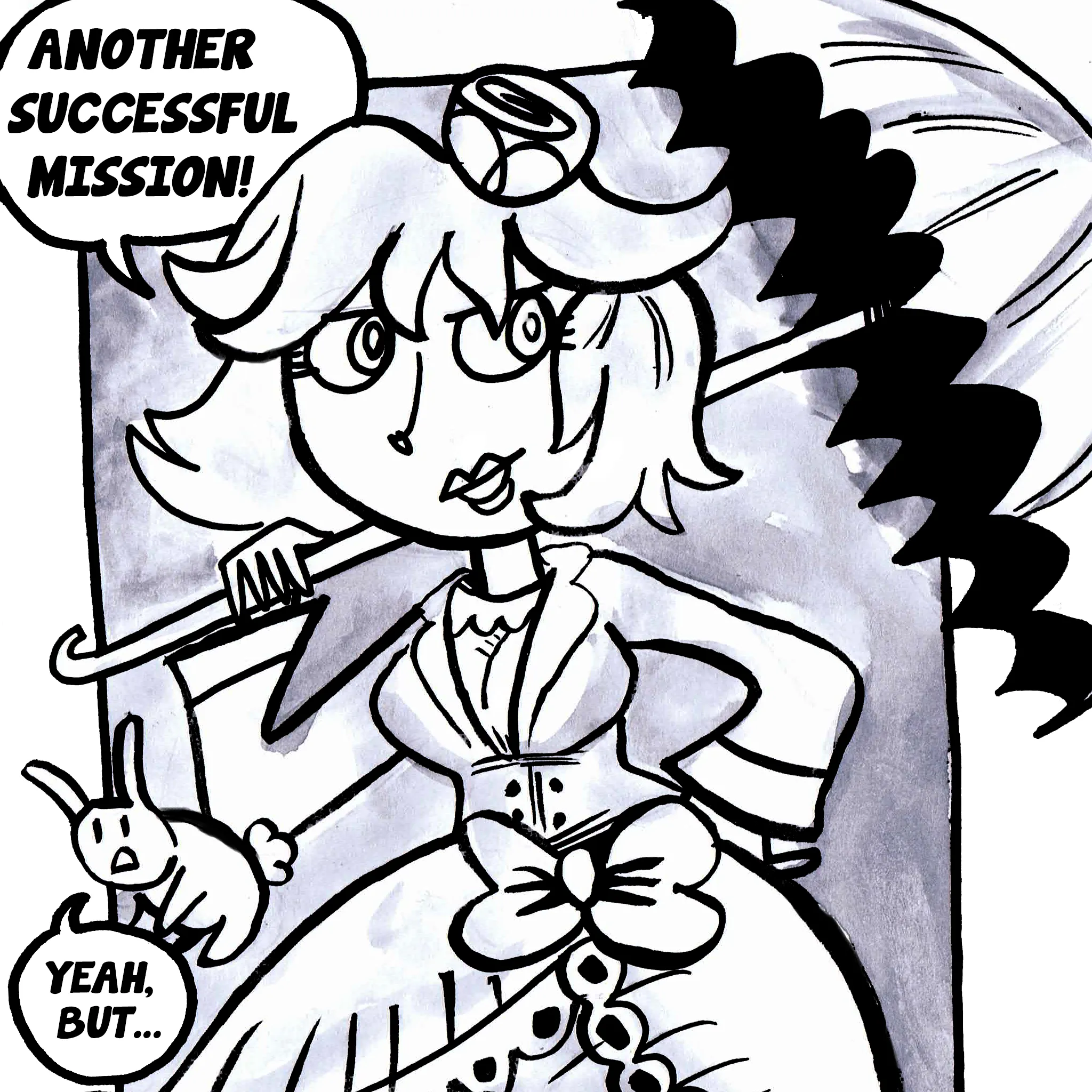
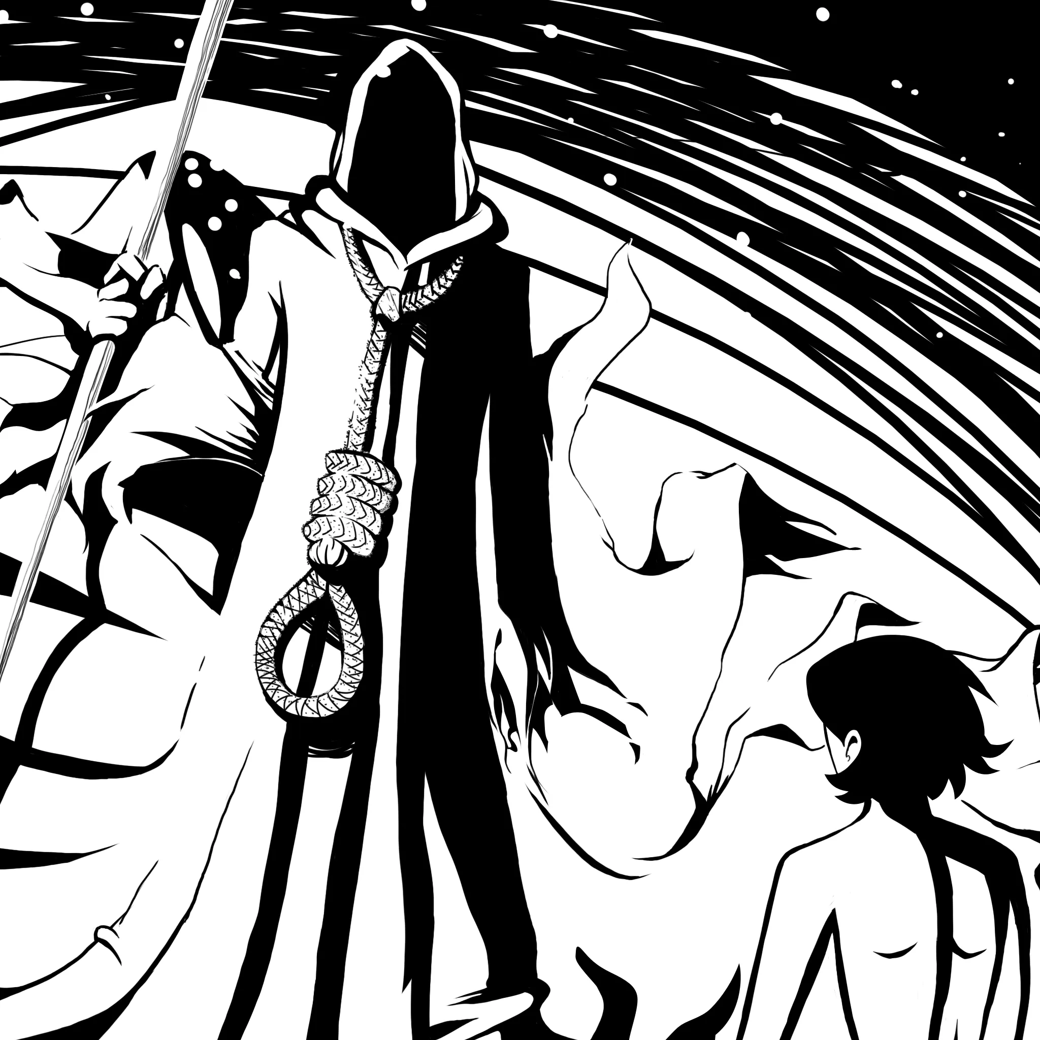
As for this latest comic, the broken window is done using Blender’s physics system. I used a plugin that allowed me to create the fractured glass appearance and then animated a large cylinder flying through the glass. All of the glass shards and flying cylinder (as a stand-in for the puppo) are marked as physics rigid bodies and then simulated to explode outwards as the cylinder flies through the glass panel. I then used the physics data and picked a good frame to render out and combine with my 2D artwork.
It still took a bit to setup, but I didn’t have to focus on drawing every shard of glass.
That’s all for this week’s post. I hope you enjoyed learning some of the behind the scenes about how certain pages in Catherine’s intro story arc were made.
Till next Saturday!