This paragraph contains inline code to test styling.
// This is a code block
function themeShowcase() {
    console.log('Testing code block colors');
    return 'All colors working!';
}This is regular body text using the default text color. It should be readable and comfortable for extended reading.
Bold text and italic text for emphasis.
This paragraph contains inline code to test styling.
// This is a code block
function themeShowcase() {
console.log('Testing code block colors');
return 'All colors working!';
}This is a blockquote to test the blockquote styling and colors. It should have a left border and background that fits the theme.
| Header 1 | Header 2 | Header 3 |
|---|---|---|
| Row 1, Col 1 | Row 1, Col 2 | Row 1, Col 3 |
| Row 2, Col 1 | Row 2, Col 2 | Row 2, Col 3 |
inline codeContent above the horizontal rule.
Content below the horizontal rule.
Control panel background with control text color
Modal content on backdrop
Enhanced accessibility while maintaining the warm, feminine brand colors. All improvements target AA compliance or better.
NEW: These links use contrast-safe gold (#E0B52B) for AA compliance: comic pages and blog posts. Notice the underlines with 2px offset for non-color accessibility cues.
On hover/focus, links show brand gold (#FFDA80) for visual pop: hover this link.
Links use contrast-safe gold (#E0B52B) with underlines for accessibility.
Original brand gold (#FFDA80) fails AA contrast on lilac.
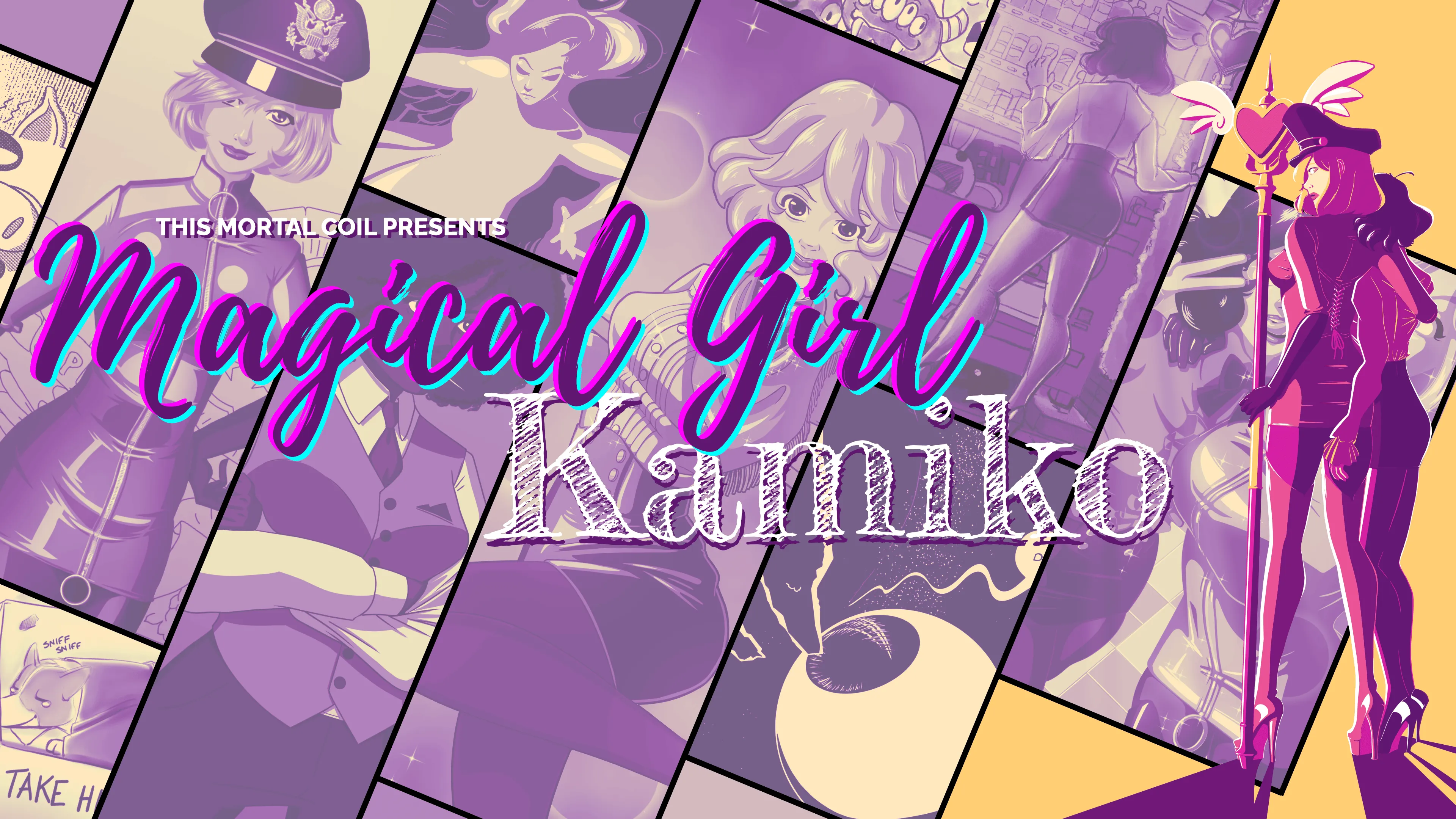
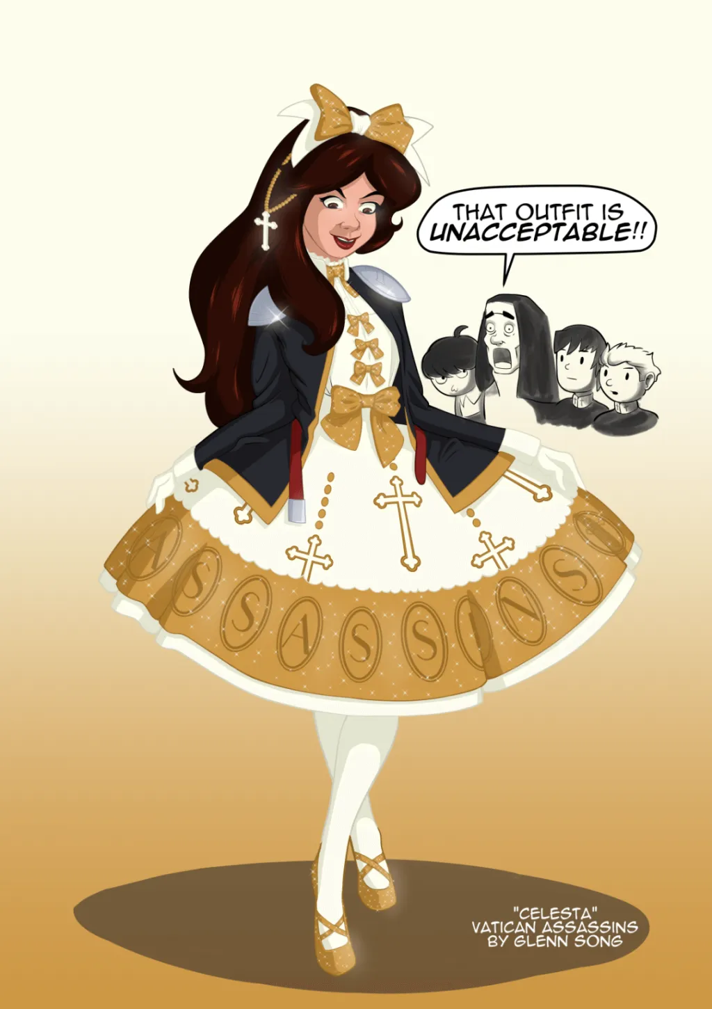
Here are various comic pages and blog posts you might find interesting. Check out our resources section for more content.
Some external links: Astro Framework, Tailwind CSS, and Vercel Hosting.
Showcasing how blog posts and comic pages appear as cards:
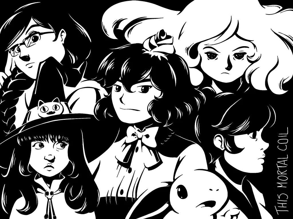
Grid layout for comic pages and gallery items:
Live contrast testing for all theme color combinations. Uses WCAG contrast formula to verify accessibility compliance.
Search the site